From: Tom Moody
Morandi (re)simplification - Jeff Baij
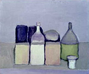
 my version above

Originally this was a side to side diptych and it looks better that way; apologies for stacking but there are reasons - let's call it a remix. The joke here is the stylization of the already stylized: art about art, yes, but somehow Morandi's fair game--it's almost a system about a system. Baij's virtual version "proves" how much the color of Morandi adds to its sensuality: there's a tendency to think it's all in the stroke (the Met's Morandi show a while back was a stunner). But at the same time he's reduced the master to a web designer's palette of elegance, highlighting the artificiality of "web colors."
It's from Baij's archive (scroll down) - see also the exploded Dalek model from the Google 3D warehouse. Much more interesting than attempts to sculpt the more cut-and-dried modern sculptures in the Warehouse. This is virtual sculpture: a hack or jape of an emerging popular form.
No comments:
Post a Comment